How to Explore Careers: A 20-Minute Walkthrough of Career Universe
This is a 20-minute walkthrough of Career Universe. It works for a student on their own, a parent and a teenager at the kitchen table, a counselor with a group, or an adult figuring out a second career. Set a timer. By the end you'll have a shortlist and one small thing to try this month.
You don't need an account for any of it, and it works on a phone or a laptop. (If you want the backstory first, here's why we built it.)
Minute 0 to 3: the map and the tiers
Open the map. The first panel says "Start here" and lists 29 sectors under "Explore a sector". Each sector is a world of work.
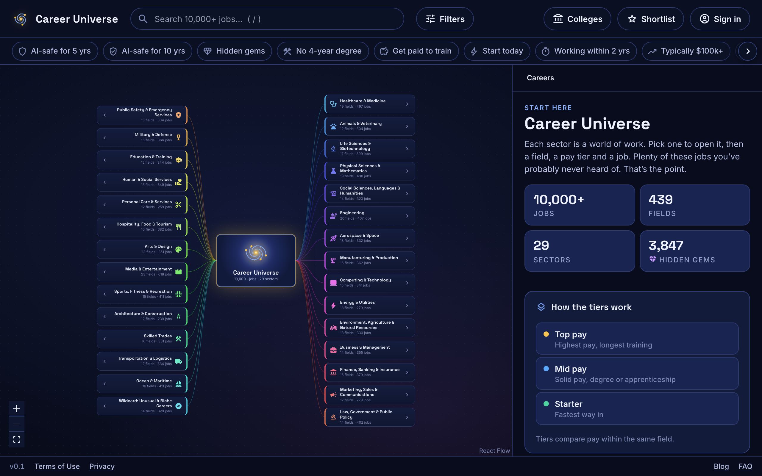
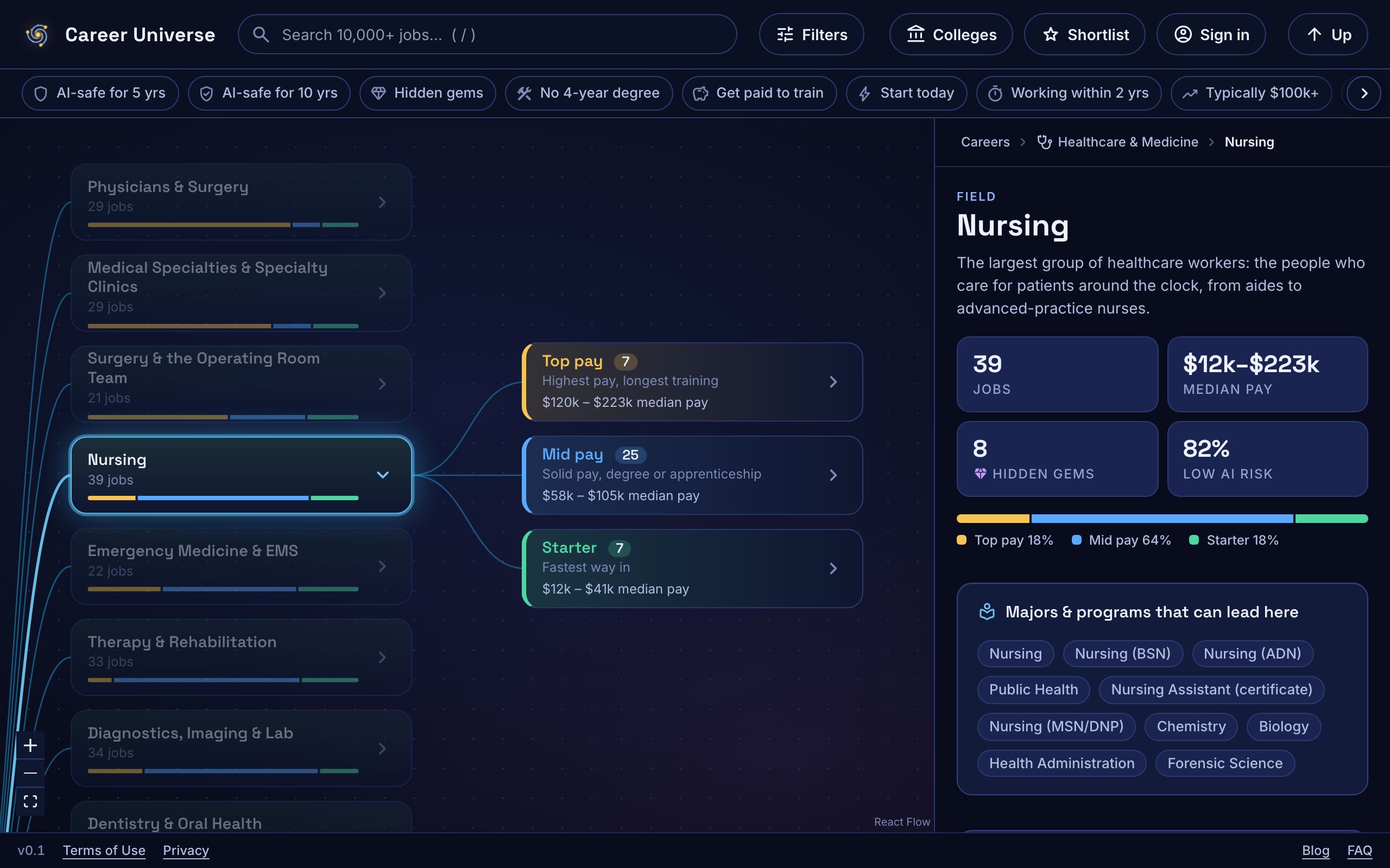
Tap one. Let's use Healthcare & Medicine. Inside it are fields. Tap Nursing. Now the jobs in that field are grouped into three pay tiers:
- Top pay: highest pay, longest training.
- Mid pay: solid pay, degree or apprenticeship.
- Starter: fastest way in.
Tap a tier, then a job, like nurse practitioner.
The one thing to understand about tiers: they compare pay within the same field, not across the whole map. A $70k engineering technician can sit in the lower tier of Engineering, because everything around it pays more, while a $70k job in another field sits in a higher one. Tiers show how a job sits next to its neighbors. They're not a ranking of the job.
Minute 3 to 8: the 12 quick filters
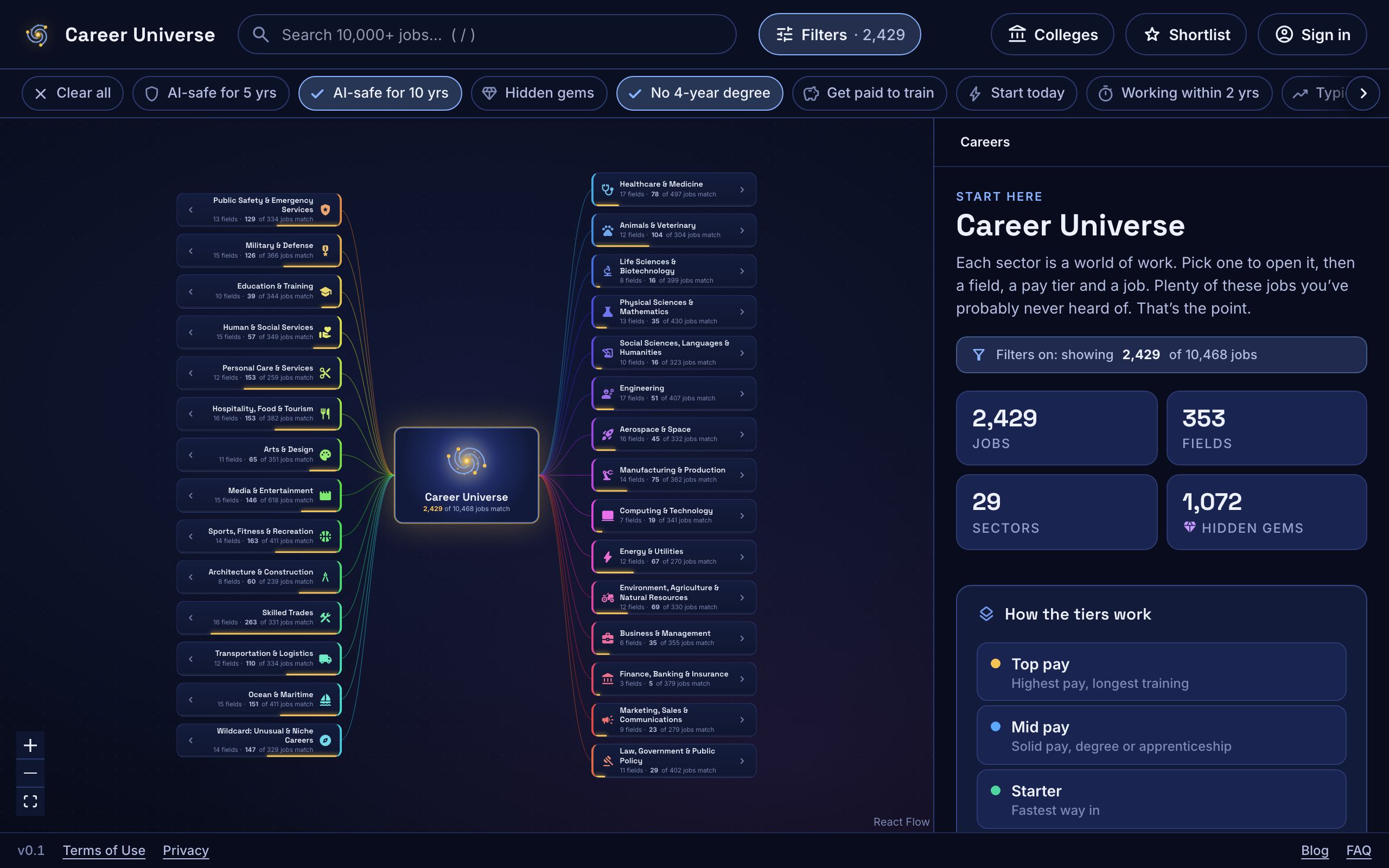
Under the top bar is a row of quick filters. Each one is a shortcut for a question people actually ask. Tap one to turn it on, tap it again to turn it off. Turn on more than one and you'll see only jobs that match all of them.
| Quick filter | What it shows | Careers in the map |
|---|---|---|
| AI-safe for 5 yrs | Rated low risk of AI or robots shrinking the job over the next 5 years | 6,400+ |
| AI-safe for 10 yrs | Rated low risk over the next 10 years | 4,600+ |
| Hidden gems | Jobs most people have never heard of | 3,800+ |
| No 4-year degree | Certificate, apprenticeship, associate degree or on-the-job training | 4,500+ |
| Get paid to train | You earn a paycheck while you learn: apprenticeship, military or paid on-the-job training | 2,800+ |
| Start today | Jobs someone could begin right away, with no course, license or degree first | 1,100+ |
| Working within 2 yrs | Doing the job within about two years of high school | 3,400+ |
| Typically $100k+ | Median pay of $100k or more | 2,700+ |
| Training under $15k | The usual path costs less than $15k in tuition, or pays you | 4,600+ |
| Fast-growing | Growing faster than average over the next 10 years | 3,300+ |
| Outdoors | Work happens outside for a real part of the day | 3,500+ |
| Be your own boss | Lots of people in the job work for themselves or own the business | 1,400+ |
A note on the two AI filters. "AI-safe" is our shorthand for "rated low risk in our estimates". It isn't a promise. How we estimated AI risk explains what the ratings mean.
Two habits make the filters more useful. Watch the sector list as you tap: the numbers next to each sector change, and you can see which corners of the map light up. And when a stack gets too narrow, turn one off. The point is a bigger menu.
If you want more control, the Filters button opens a full panel: the kind of person a job suits, pay sliders, cost of training, education needed, AI risk at each horizon, and what the work is like (where, how physical, the hours, remote work).
Minute 8 to 15: read one job card closely
Pick one job and read it all the way down. Let's use wind turbine technician, a hidden gem.
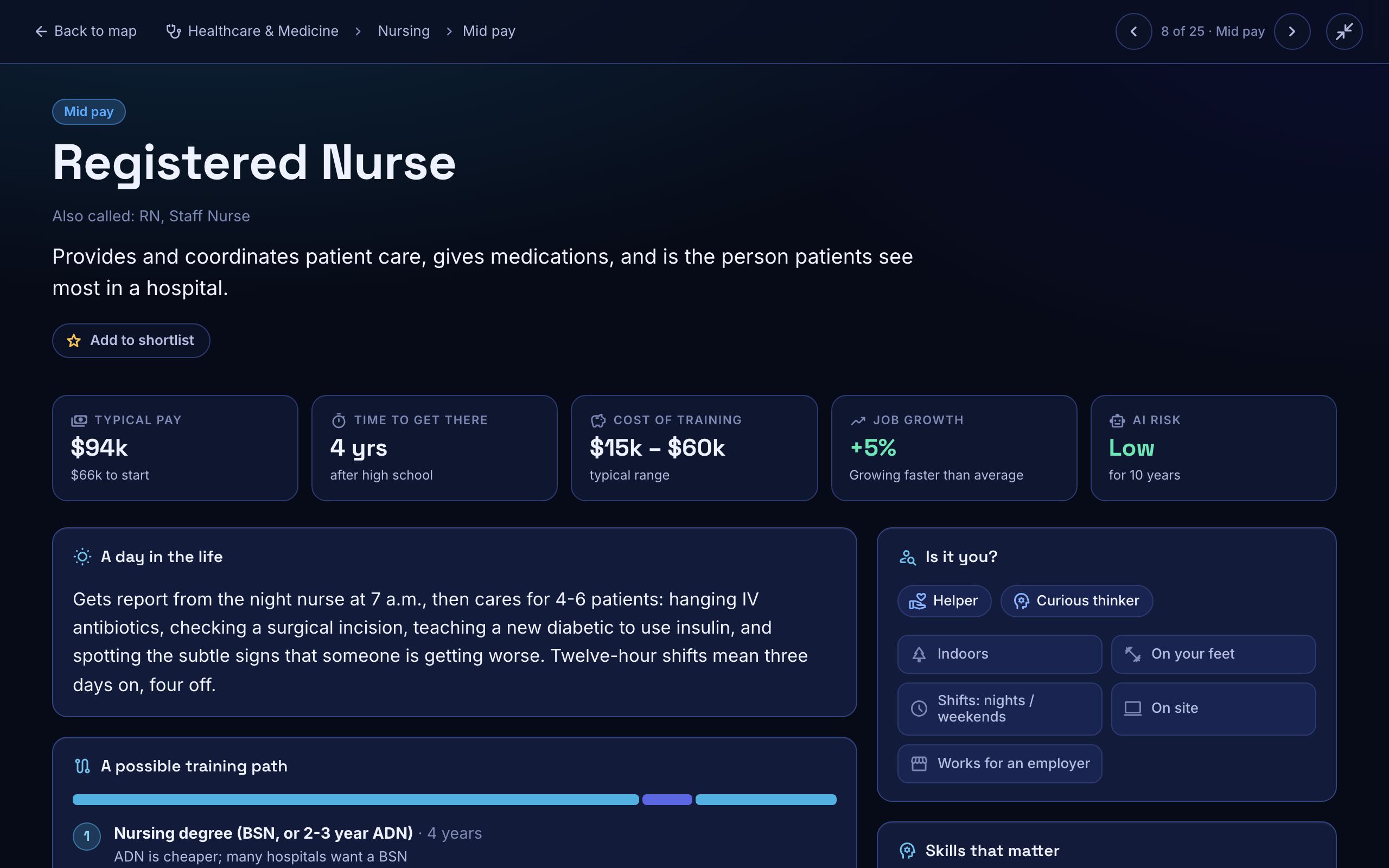
At the top are the badges (pay tier, hidden gem, no 4-year degree needed) and four key facts: typical pay, how long to get there, training cost and AI risk. Below that, these are the sections worth slowing down for.
A day in the life
Read this one out loud. It's a few sentences on what the work actually looks like on a normal day, written in plain words. If it makes you lean in, keep going. If it makes you wince, that's useful too.
Pay over a career and what "approximate" means
Three numbers: Starting (years 1 to 2), Typical (5 to 10 years in) and High (what the highest-paid 10% earn, 15+ years in). They're anchored on Bureau of Labor Statistics wage data, roughly the 10th percentile, the median and the 90th percentile.
Most pay figures in the map are marked approximate, about 92% of them. When you see "estimate" next to the pay, it usually means the job is a niche title that the government counts inside a broader occupation. Treat those numbers as ballparks. Pay depends a lot on where you live and who you work for.
Will it last?
This section has two lines. The first is the 10-year job outlook: growing, about average, or shrinking. The second is our estimate of AI and automation risk over the next 5 years and the next 10.
Tap Why to open the part I'd read first: one sentence on what changes and what stays human. For the wind tech it reads: "Drones and sensors handle more inspections; climbing towers and fixing gearboxes and electronics stays hands-on."
Start now, in high school
Classes that help, and one to three things a teenager could try now, like a club, a certification or a competition. If you're an adult, skip this one. Look instead for a "Could start right away" or "Could start within a month" section near the top of some cards, and read "A possible path".
Want more? View more details opens a full page with a possible training path, schools and programs to explore, and similar jobs.
Minute 15 to 20: star five, compare, pick one thing
Go back to the filters and find five jobs that interest you. On each one, tap Add to shortlist.
Now tap Shortlist in the top bar and choose Compare. You'll see your jobs side by side: pay, training and its cost, job growth, AI risk at 5 and 10 years, what the work is like, and the try-it-now ideas.
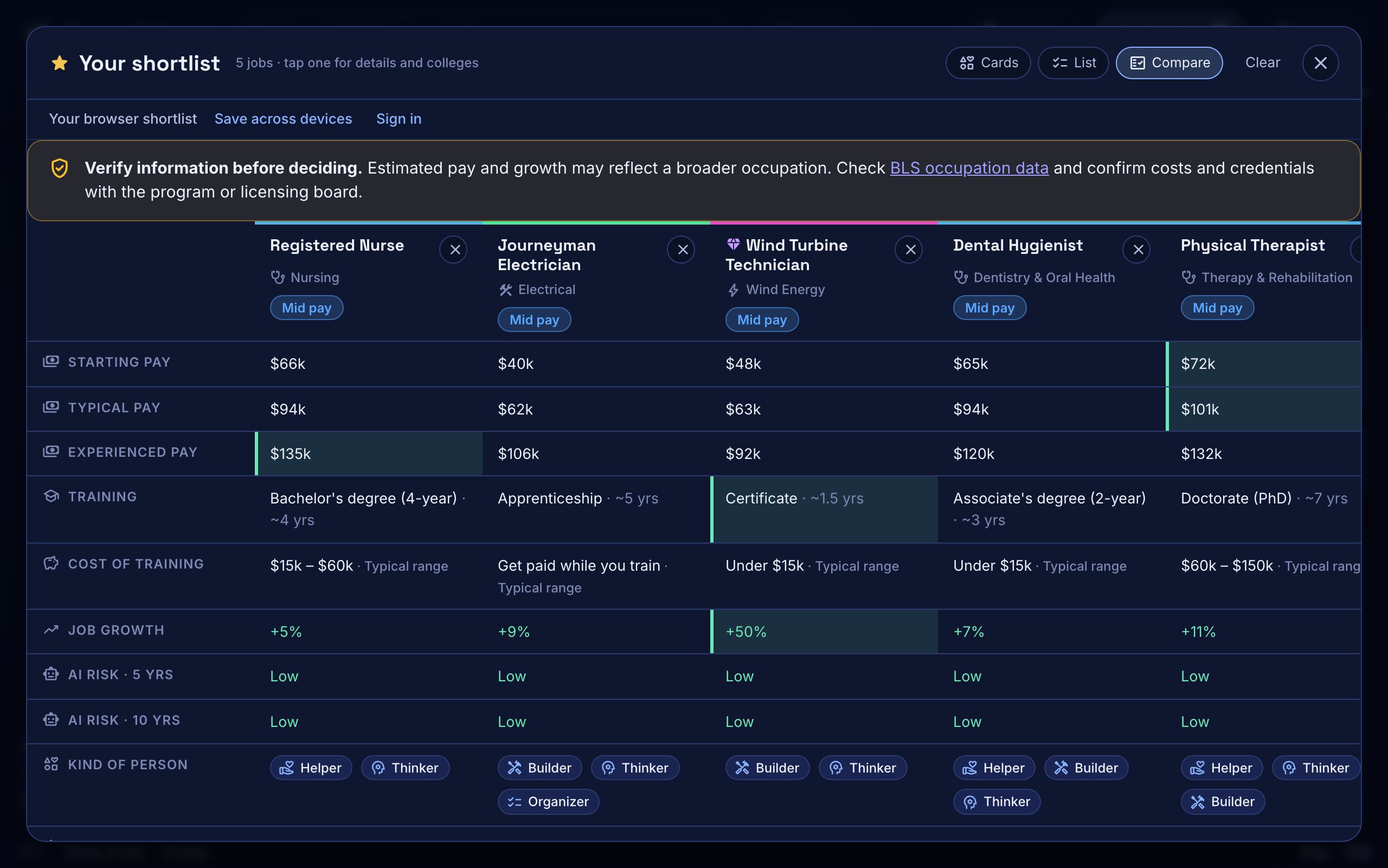
Look for the one that surprised you. Then pick one thing to try this month for that job. A club. A weekend class. A conversation with someone who does it. One is enough.
Your stars stay in your browser on that device. If you'd like the same shortlist on another device, you can create a free account with an email code. It's optional.
For counselors: running this with a group
You can use the map with a class or a co-op right now. Students don't need accounts, there's no roster and nothing to sign. Using the public site that way doesn't make Career Universe a school records provider. Students under 13 should explore as guests with an adult alongside.
One way to run it:
- Put the map on the big screen and do minutes 0 to 3 together.
- Pair students up. Each pair picks two quick filters and reports one job neither of them had heard of.
- Each student reads one "day in the life" out loud to their partner.
- Everyone stars five jobs and writes down one thing to try this month.
Nobody gets a score or a label. That's on purpose.
What the map can't tell you
The map can make the menu bigger. It can't tell you whether you'll love a job, what the market looks like in your town, what your state requires for a license, or what you'll actually be paid. Everything in it is an idea to explore, not a verified fact. The careers were written with AI research assistants against a strict schema, checked by validation scripts and spot-checked by hand, by a very small team.
So check what matters. Talk to someone who does the job. Read the school's own pages. Look up the BLS Occupational Outlook Handbook. If something in the map looks wrong, email privacy@tarvacore.ai with the job name and what you think is off. We update the data from time to time and fix reported errors.
Questions people ask
What do the tiers mean?
Each field splits its jobs into Top pay, Mid pay and Starter, judged from pay and training within that field. They show how a job compares with its neighbors. They aren't a ranking across the map, and they aren't a judgment of the job.
Why does a $70k job show in the lower tier?
Because tiers compare pay within the same field. A $70k engineering technician sits in the lower tier of Engineering because most jobs around it pay more. The same pay in another field could land in a higher tier.
What does "approximate" mean on pay?
The figure is a ballpark. Pay is anchored on Bureau of Labor Statistics wage data, but the government often counts niche job titles inside a broader occupation, so most figures were researched and spot-checked rather than pulled straight from an official number. About 92% are marked approximate.
Why is the "to get there" number different from years of school?
It's the usual time from finishing high school to actually doing the job. For some jobs that includes steps beyond the classroom, like an apprenticeship, a residency or a certification. For jobs you can start right away, it says "Now".
Can I use this on a phone?
Yes. The map works on a phone or a laptop, and you don't need an account. On a phone, swipe the quick filter row sideways to see all 12.
Your next step: set a 20-minute timer, open the map, and follow the script. If you want to think about the AI ratings next, read How to Use AI-Risk Ratings When Choosing a Career.
Sources: BLS Occupational Employment and Wage Statistics and the BLS Occupational Outlook Handbook. Counts are from our own estimates in the map. Parts of the research behind Career Universe were written with AI research assistants and checked by hand.